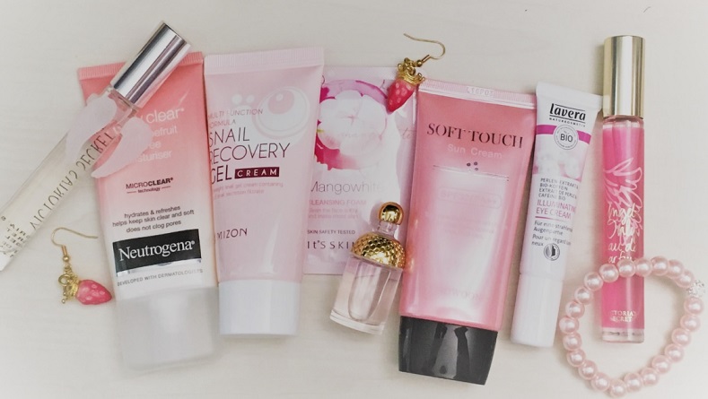
But nothing stops me from dreaming while browsing skincare. Especially finding smaller brands with quirky designs is rewarding.
Pink as a color is a gentle, comforting one, usually used for hydrating and moisturizing products for a dry and sensitive skin. I guess that's a reason I rarely have pink products because my combo skin type has forced me (in my mind) go for the purifying products, usually green or blue in color, or other more primary or dynamic color like orange. It seems it's necessary to make products that target problem skin as aggressive as possible for some reason.
Please let me know if I've missed something incredibly cute and pink that I should know about! :)
Disclaimer: I don't own any of the following pictures. They are promo pictures and property of the mentioned brands. I'm not gaining anything by showcasing them except happiness because of the cuteness.
Indy Beauty
Everything is packaged in peachy pink. A bit of a modern clean pharmacy look with sleek packaging, printed with very eye catching big slogans that make the look at the same more relatable but also cheapens it a bit. Some of the products contain coconut oil in case you're avoiding it like I am (in face products). All products are vegan and made in Sweden.

Choice Finland
Everything is packaged in pink and the lace pattern is to die for. I would design something similar myself as well! There's something very timeless and retro at the same time in the design. All the products are vegan as well and made in Finland. I really want to try the Rosehip Balm, both for the cute packaging and ingredients.

Lumene

Pixi
Pixi's products have this young, trendy girly look that feels a bit of retro as well, maybe it's the bottle shapes/designs. The combination of mint and pink is very dreamy. I do like it how Pixi has many product lines and everything is designed to look cohesive and recognizable.

Caudalie
Caudalie has products in different shades of pink, maybe inspired by the grapes. There is something very effortless about the designs and they are not too girly nor very old, they feel fresh. Anyway my opinion is probably also swayed by Moisturizing Sorbet that I love (both the cream and packaging, it's the light pink tube).

Lancome
Lancome's cute products packaged in pink with rose motifs are a good example, how such a simple classic idea works so well time after time. You rarely go wrong with flowers + cute color. The bottle shapes are sleek and stylish as well. Exactly the type I would impulse buy if I had a weak moment.

Glossier
I've heard a lot about Glossier and its "millennial" look. As it happens I'm an early millennial and I do like the designs! They are somewhere there between a pharmacy and trendy look, that looks almost underdesigned. The shower product designs with red and beige however look actually very new, cartoonish and expensive, even. I would buy them. Maybe it's a good thing Glossier is not available in my country!

Cow Brand Mutenka
This old Japanese brand has a weird name, but it is apparently a straight reference to cows and steady business model. The look of these products is just so sweet and simple, almost like they would belong to Barbie dolls! I'm probably going to try the cleansing oil one day.

I must admit, Whamisa's aesthetics work so well with the brand message of all natural skincare. The product designs are again very effortless, soft, almost like no-design look, "they just ended up looking like this". Very clever. Yeah, I would absolutely impulse buy in a weak moment based on packaging alone, and I almost have, but I'm a bit afraid of fermented skincare.

#17VDerma
The brand has only two products, these adorable, pink paw shaped peeling pads and sheet masks. I must admit this is a cuteness overload and I might have to order them just based on the packaging. Cats + cute color is another thing that always works! #17VDerma is a Korean brand and also vegan.

Blossom Jeju
Now, this is elegant and pretty. Perhaps it's the round shape of the bottles and the flower lace pattern, again this something I would go for if designing packaging. It's not too try hard and has an airy quality to it. Blossom Jeju is a Korean brand and inspired by pink camellia flowers that grow in Jeju Island.

Merbliss
The brand's whole concept is quite intriguing, a wedding theme?! It just can't get any girlier than this. All of their products are cute even though I get a feeling they are aimed for teenagers dreaming of their wedding in the future. I am still attracted to them, Merbliss seems like they're not taking the product design too seriously (even though they are because skincare is competetive business!).

Benton
Benton's Cacao series is very pleasing to the eye. It looks comforting and stylish, the design looks effortless. Almost bought the toner because of the look, but I'm unsure how they would work for my skin.

Nivea
Nivea's soothing series looks very fresh and trendy and even though they use a bit weird color combinations, that actually works. The packaging is too busy for my taste, but it is very approachable. I've used Nivea's products earlier and they were a safe choice for my skin so that probably affects my view. I am tempted to try these ones as well, they are affordable and cute, especially when put together like in this picture.

Dr. Barbara Sturm
Obviously, this series has been designed for kids. But it's just so adorable I couldn't pass it by! The pink is very light and peachy and the packaging design very clean, very mature and balanced despite the animals. I could easily pick up some kids' cream to use if it's packaged like this!

Rare flowers series looks very attractive, I really like this shade of pink and the angular shapes of the bottles. They have quite a timeless look to them, even though I think the design for texts needs a bit work, but I do like the font choices. Rare flowers is such a clever name because it creates the feeling of luxury! I have been tempted to try these products because of the packaging many times.

Louis Widmer
Now we have gone fully baby pink! Everything looks very cohesive; simply and well designed pharmacy products. Maybe a bit boring even, borderline babyish, looks a bit old fashioned? White and pink only as a color combination can be a difficult one to pull off. I like the round bottle shapes a lot, the toner is very much calling for me. Louis Widmer is made in Switzerland. Funny thing, when someone mentions "pharmacy cosmetics" I think of Louis Widmer first, not the French brands. Maybe my mom or other relatives used these products when I was little?

Aco
Aco is a Scandinavian pharmacy brand founded in Sweden. I feel like the designs are at the same time clean and functional but still a bit messy - maybe because the logo is dark compared to bright pink product names and they are about the same font size. The warm pink color is very inviting and the bottle shapes are pleasantly plump looking.

No comments:
Post a Comment